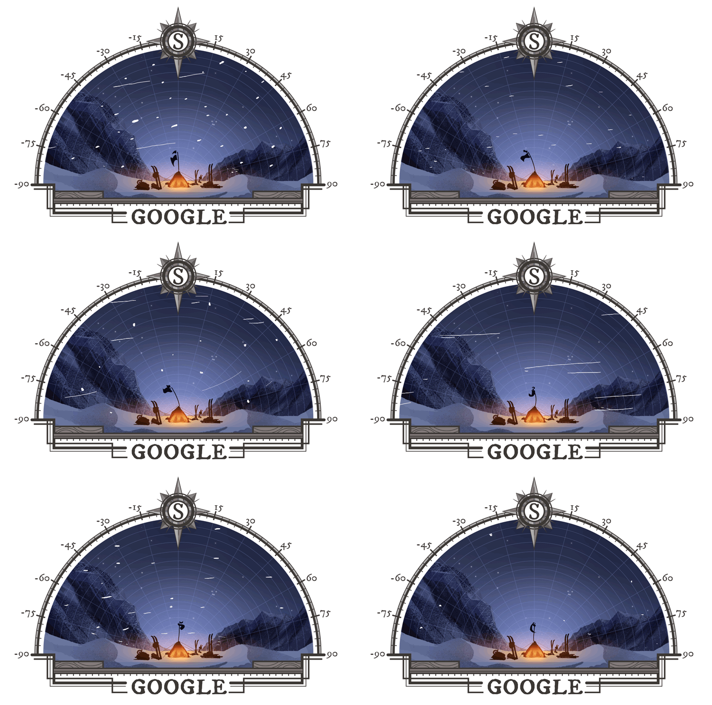
Commentary on 'first expedition to the south pole' google doodle
I’m a bit conflicted on today’s google doodle. It’s great to recognise Amundsen’s expedition to South Pole, and the graphic has a nice visual aesthetic, but I’m disappointed that some of it’s simplest elements are so wrong.
 In honor of that achievement, today’s Doodle depicts the crew at the finish line
South Pole - Antarctica in general - is a really special place. I think it’s typical for people who’ve spent much time there to want to share the place, and what makes it special. Maybe that’s why I find it annoying that google would contribute to misunderstandings of the South Pole?
Amundsen got to South Pole about a week before the summer solstice, about the equivalent of 11:30am in the Pole’s one-day year. There’s no dark sky at Pole for a few months either side of the solstice, certainly no stars. Amundsen knew that; it would be surprising if they took a lantern on the journey to Polheim (the name they gave the camp at Pole).
South Pole is flat. Imagine the surrounding geography as the middle of a frozen sea, with no shore in sight. There are no mountains on the horizon, the closest thing you’ll see is an occasional mirage when the weather cooperates. Contributing to the “frozen sea” analogy, sastrugi made by the (generally light or nonexistent) wind moving snow (actually fine ice crystals) around look like frozen waves.
Anyway, there’s my rant.